The Letterform Archive’s pop-up exhibit, History of Type: Tools and Technologies, is now open in Oklahoma Christian University’s art gallery.
According to its website, the Letterform Archive is a nonprofit center for inspiration, education and community. The Archive opened in San Francisco in 2015 and has welcomed over 5,000 visitors since.
“We hold physical and digital artifacts in a variety of formats, including books, periodicals, posters, sketches, original art for reproduction and related ephemera, as well as a robust reference library,” the Letterform Archive site said. “Together, these works chronicle the history of written communication, from the invention of writing and medieval manuscripts to modernism, the age of print to the present explosion of digital type.”
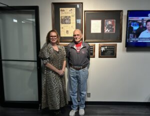
Assistant librarian and Oklahoma Christian alumna Kate Goad and editorial assistant Florence Fu spoke in the art department’s chapel on Tuesday before the opening of the gallery in the Garvey Center, giving a brief history of the development of technology involved in print.
“The process work that we have has been very beneficial for our education programs, but we feel like it’s also preserving an important part of type and graphic design history,” Goad said. “The technologies for type design have changed tremendously over the last couple of decades and radically over the last few centuries. What’s kind of crazy is that the process for creating them is pretty much the same.”
Goad said as technology advanced with the invention of the printing press and the printing of books and manuscripts became easier, people had reservations about the new technology.
“Two things happened when they started printing with letter cuts,” Goad said. “One is people got really freaked out because everyone had been writing by hand and this was a new technology. It was actually considered a black magic when it first began. One of the reasons Gutenberg chose to use a type that looked like hand lettering was to help people be very comfortable with it because it was something they recognized.”
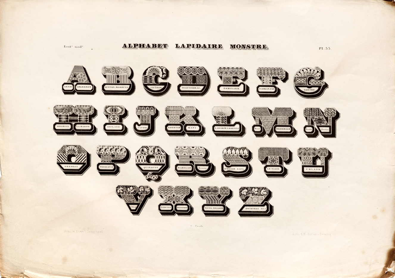
The exhibition, according to Goad, is a crash course in the evolution of type technologies starting with Gutenberg’s letterpress.
“Type design tools and technologies adapted to solve problems—what if I want to print really big letters, or how do we make access to printing cheaper and more accessible?” Goad said. “This exhibition chronicles the tools and technologies that answer those questions.”
Although she said all the works in the gallery are equally important to the history of type, Fu said she loves the Morisawa glass font plate and brochure in the section about phototype. Because it is one of the few non-Latin pieces in the show, Fu said it helps open the conversation around type history beyond the Western world and positions it as a global development.
“The works we chose [for the exhibit] capture not only the development and changes in tools and technologies for typesetting and graphic production over time, but also point out the social and political implications with the democratization and access to these tools and technologies,” Fu said.
According to Fu, studying type and lettering taught her letters can be more than tools for communication, but can also be for expression when it comes to graphic design.
“Type and letterforms are everywhere—we encounter and interact with them every single day,” Fu said. “I think it’s interesting to think critically or just be aware about the relationship between letterforms and language. How are designers choosing to dress certain words, statements, stories, logos, book titles, etc.? What speaks to us and what is rubbing us the wrong way?”
Goad said there are always two parts to everything people read—the content and the vehicle—and the vehicle can enhance or detract from the message. Learning about type or lettering helps people better understand the context in which letterforms are made and how the words reach them, according to Goad.
“I think we take these things in subconsciously, through subtleties,” Goad said. “Sometimes things don’t resonate as well as they could, because the vehicle is inappropriate. If you are writing a love letter, it shouldn’t look like a newspaper. I believe that learning about type and lettering can help you communicate more effectively.”
The exhibit will be open through next month and is free of charge to visitors.


Be First to Comment